Why Luxe Brands Are All Using The Same Font
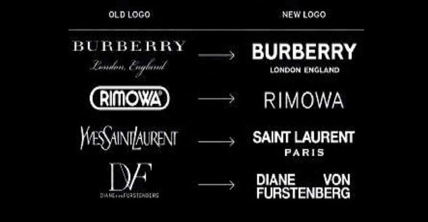
Shortly before London Fashion Week, Burberry Group Plc unveiled a new version of its logo before the first runway collection under new Chief Creative Officer Riccardo Tisci. Perhaps a rose by any other name would smell just as sweet - but what if that name were written in Comic Sans? Typographic logos are tricky things: They can communicate trust or chaos, make you look smart or clueless, and come across as expensive or cheap. If the name belongs to a company that stands for heritage and quality, getting this right is serious business. Shortly before London Fashion Week, Burberry Group Plc unveiled a new version of its logo before the first runway collection under new Chief Creative Officer Riccardo Tisci. The old Burberry word mark hadn't changed much since its 'equestrian knight' was registered more than 100 years ago. It looked like something chiseled into the side of a venerable government building. The new logo has a heavier, bold look with a geometric sans serif treatment. It's louder, like a sticker on a skateboard. It was created by graphic designer Peter Saville, famous for his Factory Records album covers in the 1980s. Although he's no stranger to highend clients, Saville resists the idea that typefaces possess an intrinsic meaning or price tag. 'Luxury typography' is kind of a non-sequitur," he says. Instead, he was guided by Tisci's desire for the treatment to work just as well on a gabardine raincoat as on a chiffon blouse. Many purveyors of upscale goods are choosing a similar feel. Bill Gardner, a designer who tracks corporate identities, cites a litany of pricey brands that lately have opted for the all-caps sans-serif look: Céline, Rimowa, Diane von Furstenberg, Balenciaga, and Saint Laurent, as well as Saville's own refresh of Calvin Klein in 2017. All have been transformed into crisp-angled letterforms. The overall trend is hard to miss: Luxury isn't connoted with fussy extras; no-nonsense boldness is the rule. Armin Vit, co-founder of design firm Under Consideration says the bare-bones look is "like wearing a black-tie tuxedo." It's not flashy but leaves room for personality to come through in other ways. In Burberry's case, that includes a striking monogram print from Saville that the company is using in its rebranding efforts. Sarah Hyndman, a designer and author of Why Fonts Matter, has spent years testing playful associations between typography and luxury. After asking hundreds of people in surveys to respond to fonts as 'cheap,' 'expensive,' or somewhere in between, she found that most consumers tend to view high-contrast fonts with thin hairlines, such as the old Burberry logo, as more high-end. Script treatments such as the one that renders 'London, England' beneath the word mark might aim to suggest the sophistication of a Bordeaux wine label, but in a fashion context they come across as pretentious or "trying too hard." Ultimately, luxury isn't about mimicking trends. It's about a timeless and enduring form of value: current yet classic, expensive but worth it. The new Burberry logo isn't very different from those of other fashion brands, but that's also by design. After all, a tuxedo may communicate an image of refined taste, but not if you're the only person at a party wearing one.
Textile Excellence
If you wish to Subscribe to Textile Excellence Print Edition, kindly fill in the below form and we shall get back to you with details.


